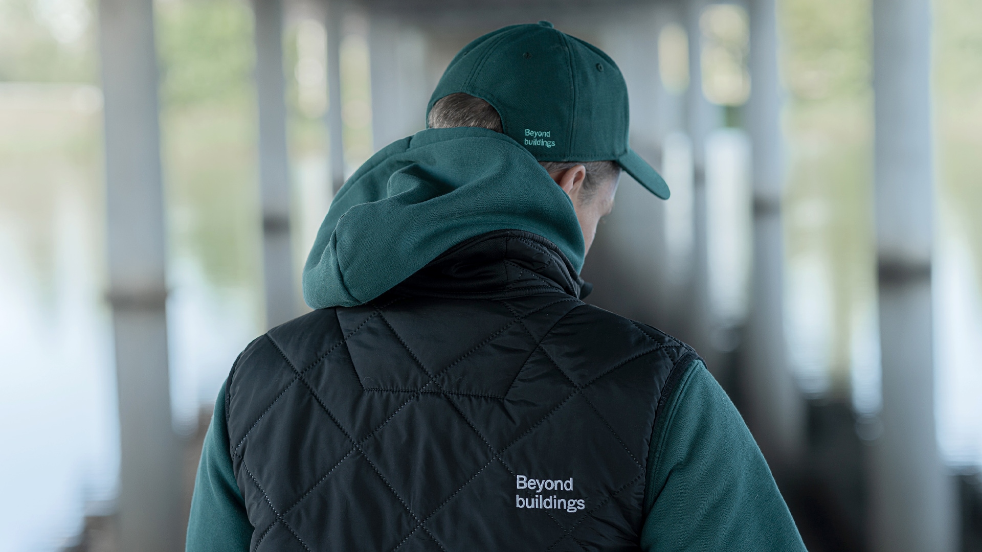
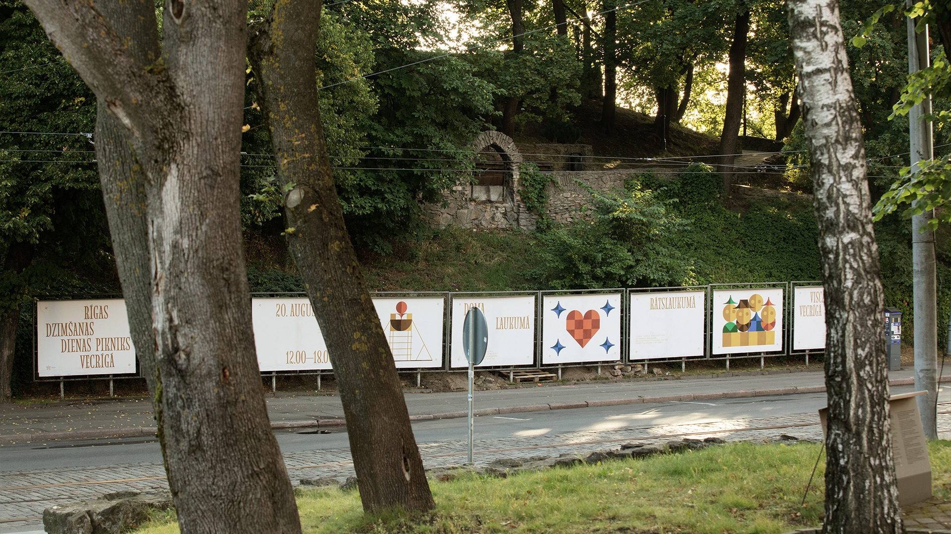
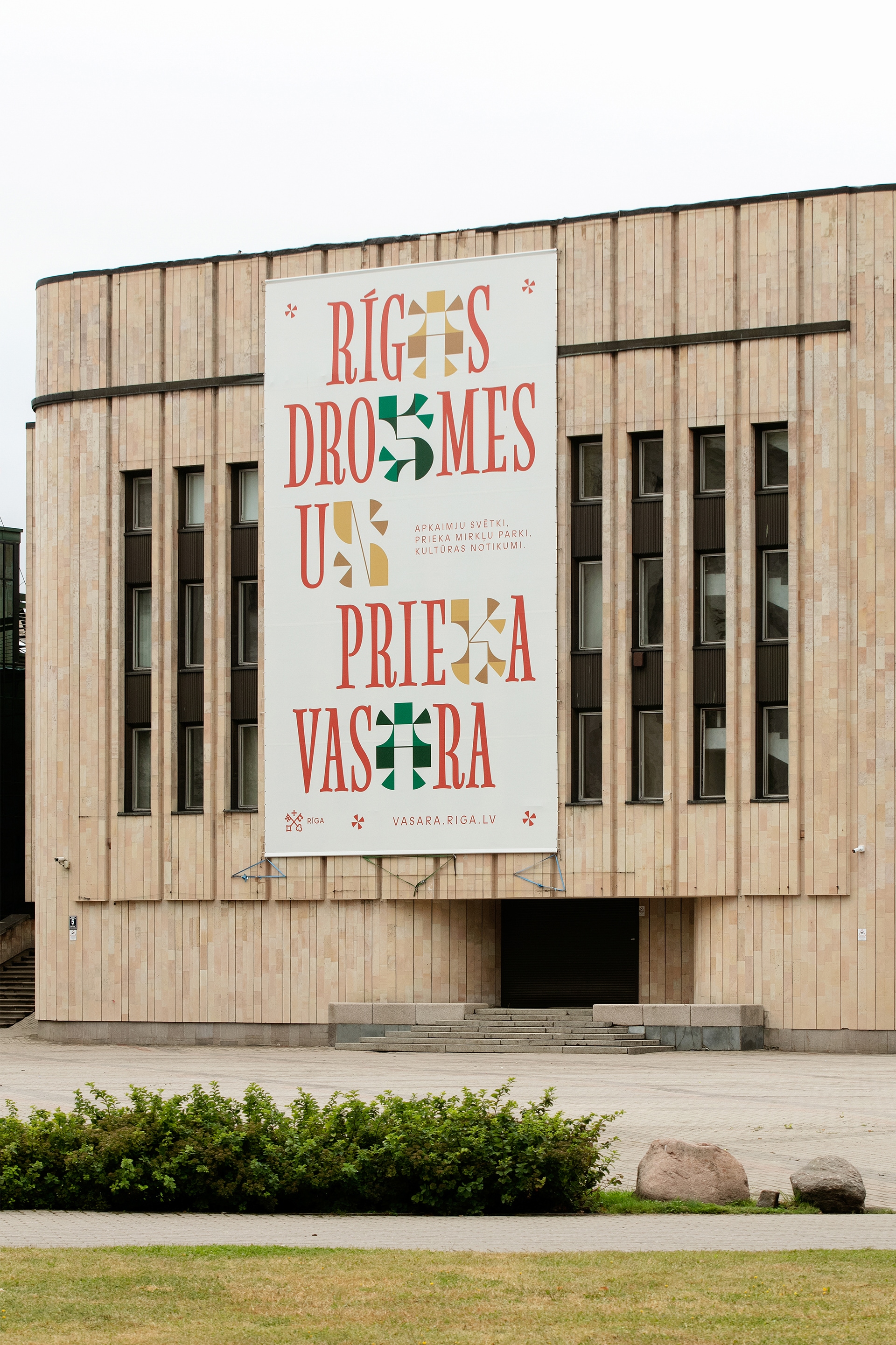
Identity for a Summer of Courage and Joy
In summer 2022 an expansive culture program took place in the capital city of Latvia. The Summer of Courage and Joy (Rīgas Drosmes un Prieka vasara) was a two-month program of public art, educational events, and entertainment hosted by the Riga City Council. The theme of Courage and Joy served as a direct response to the prevailing geopolitical situation caused by the war in the region as well as a central motif of the public events.
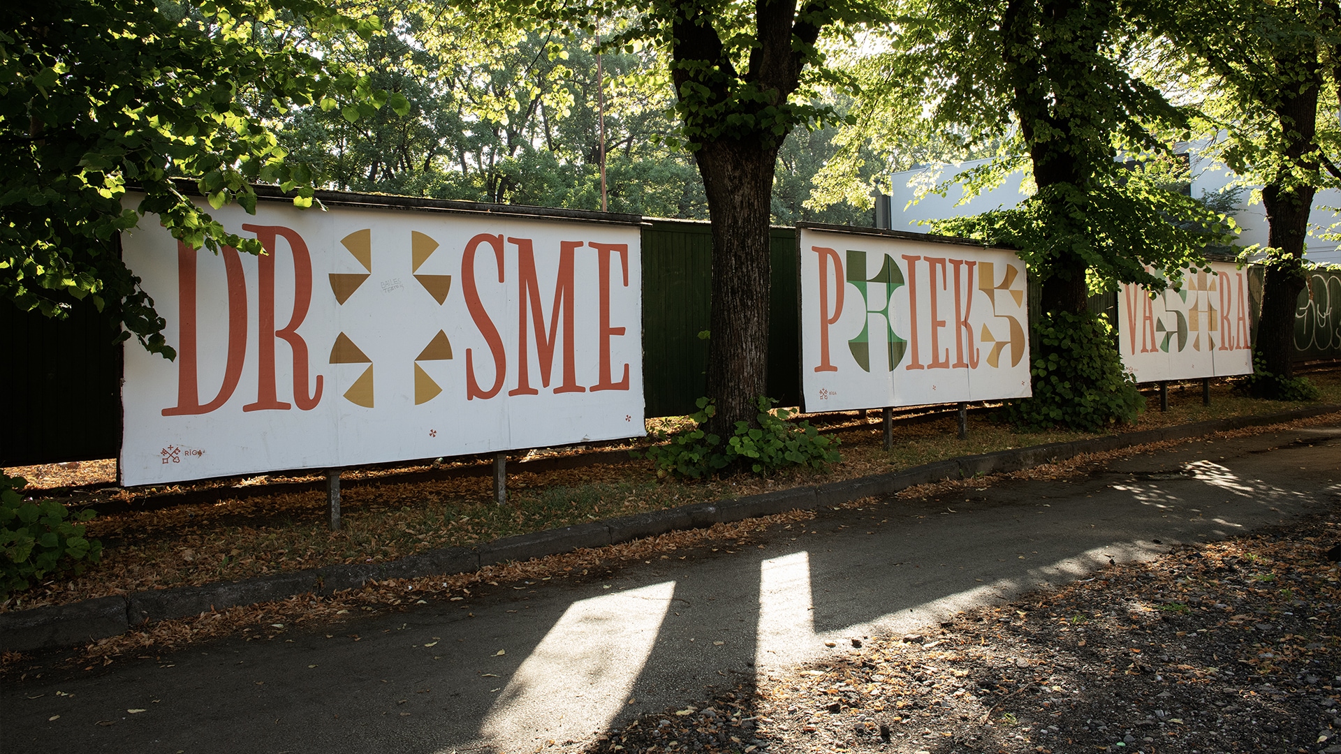
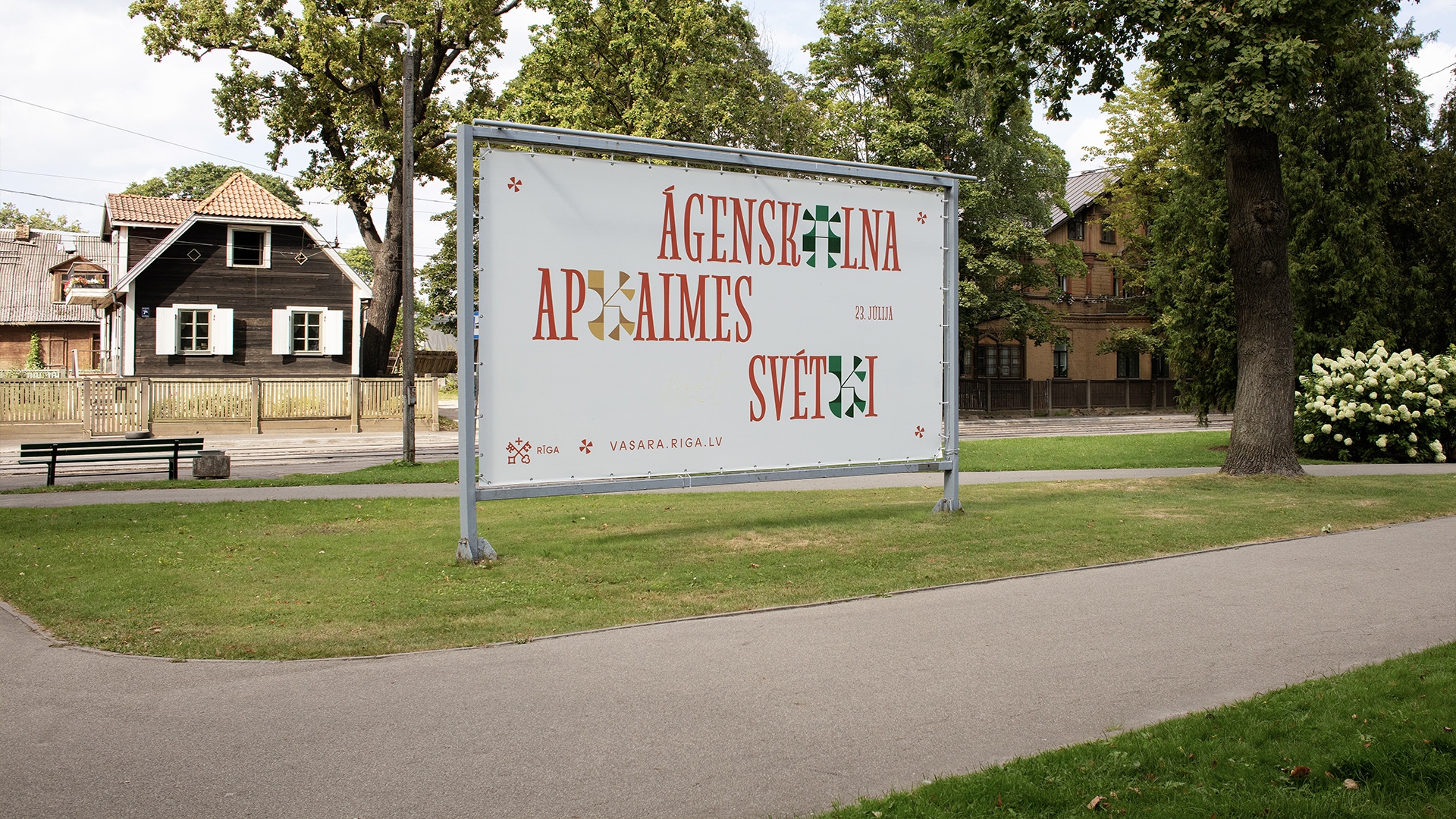
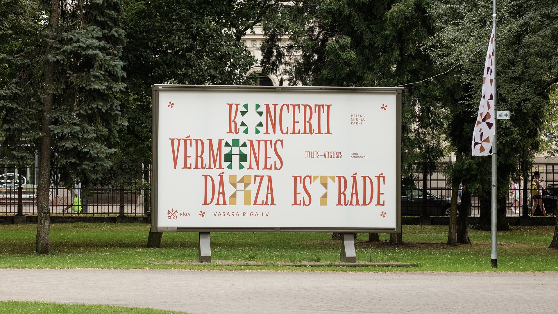
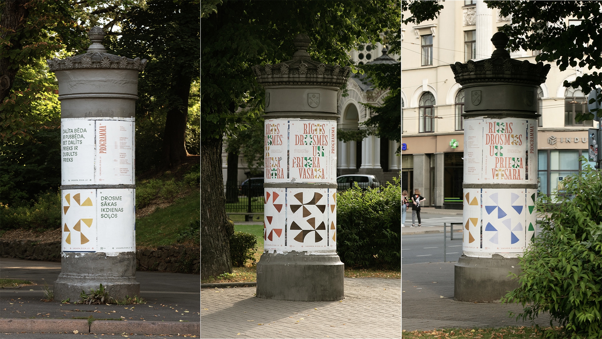
With an aim to forge interaction between people and the city, we joined the Riga City Council team to build a text-based visual identity that served as a scenographic environment for the summer events in the city.
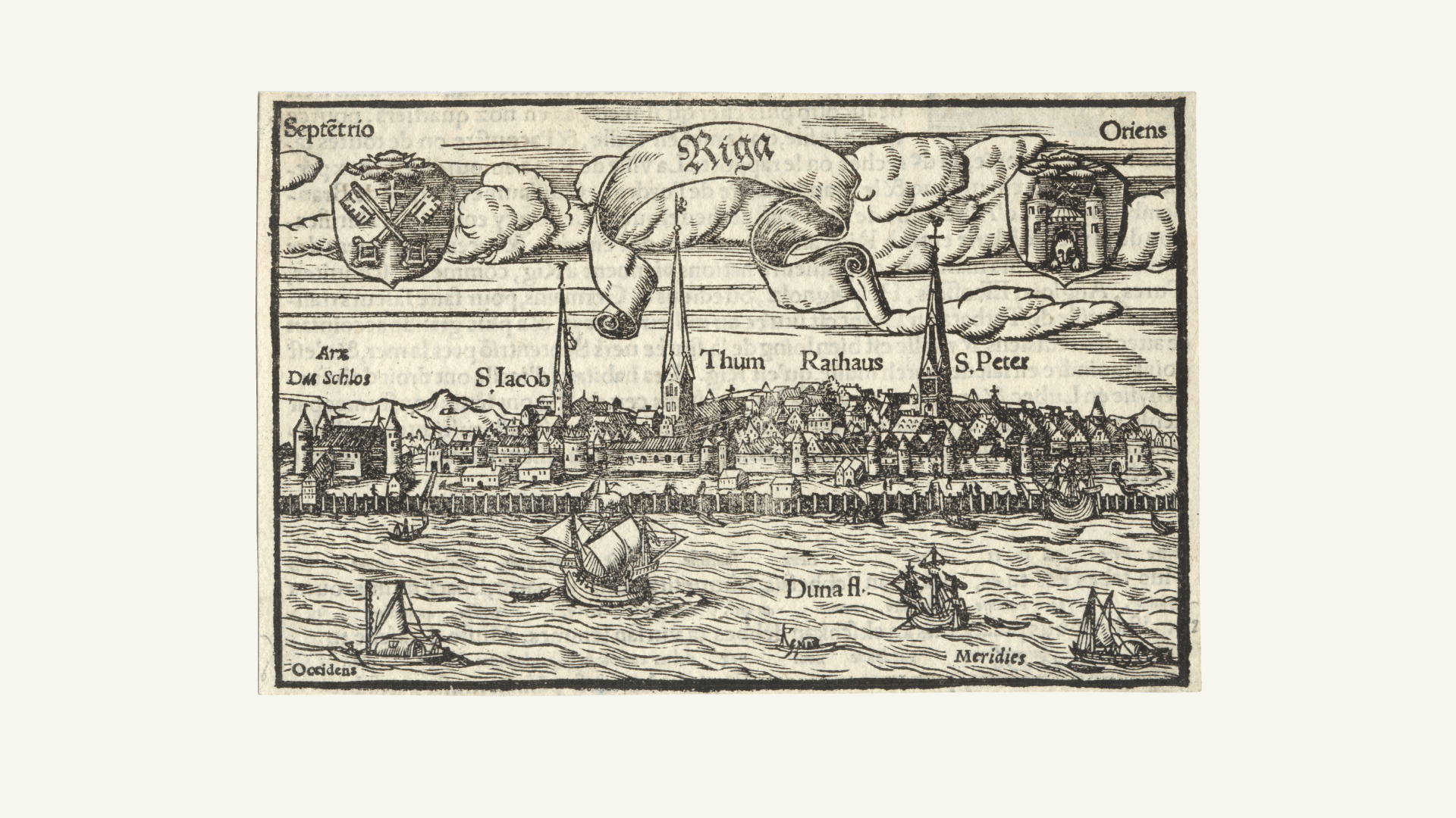
Panorama of Riga - before 1547. Author: Hans Johann Hasenöter (Hans Johann Hasentöter, also Hasentödter, c. 1517–c. 1586).
Publisher: Henricus Petrus (Henricus Petrus, 1508–1579), Basel. Paper, woodcut. 10.5 x 16.5 cm. (From: Cosmographia, 1550.).
Riga History and Shipping Museum, VRVM 32694
The history of Riga
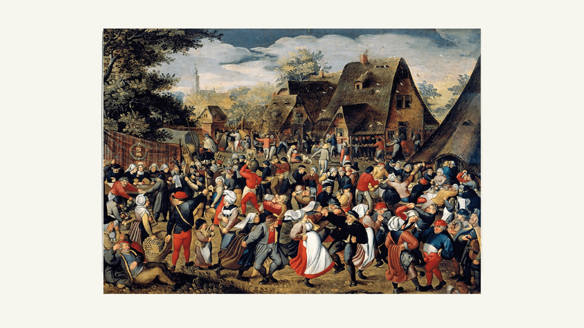
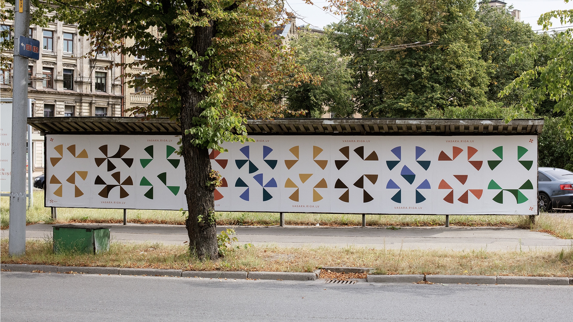
Visually the identity was heavily influenced by the time of the Hanseatic League — a medieval commercial confederation with a huge historical influence on the development of Riga city.1 While medieval references provided typographic solutions to convey the idea of courage, we looked at historical “places of joy” – parades, theatres, and playgrounds – to build a festive colour palette for summer-long events.
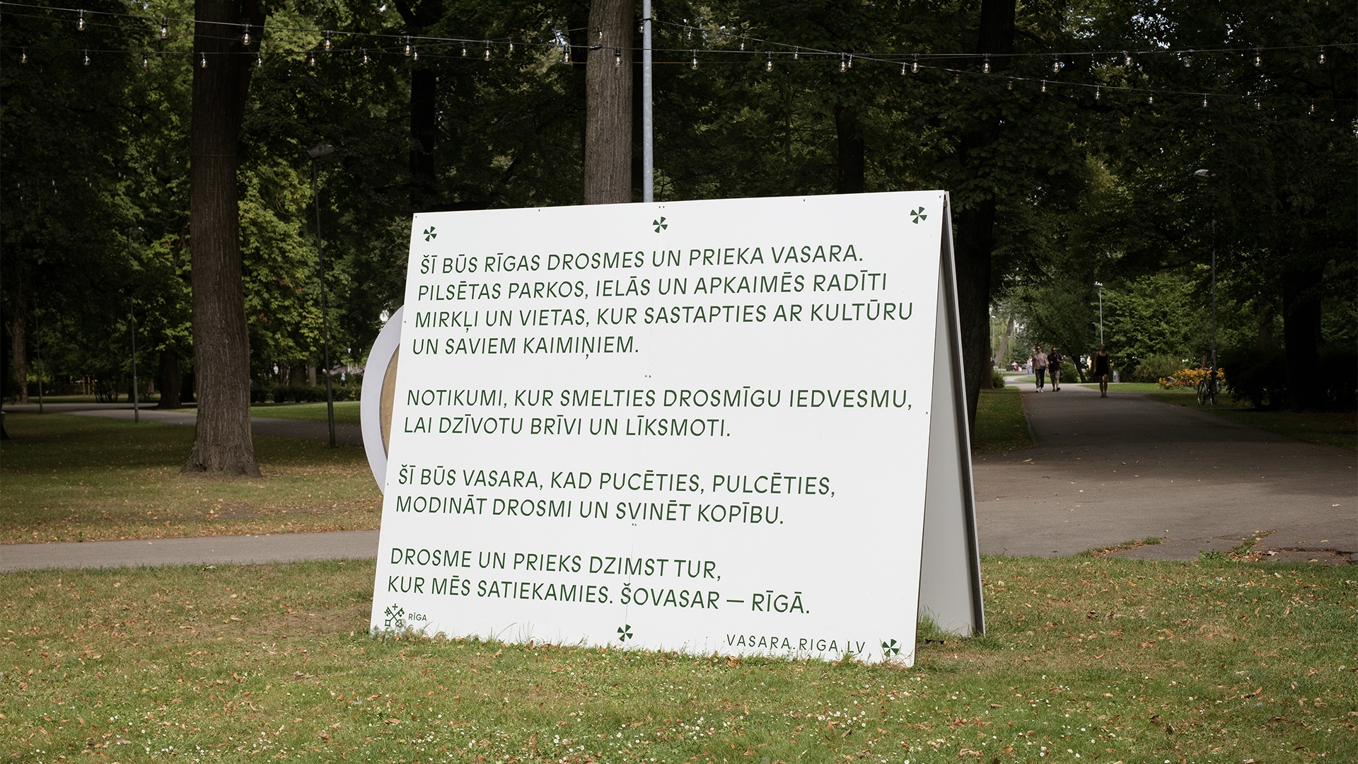
Manifesto
The manifesto of Courage and Joy was a conceptual framework we co-developed with Riga City Council and writer Henriks Eliass Zegners for the summer events.2 Embodied in various objects, it was an invitation to engage and partake in community activities happening all around the city and collectively create Joy and train Courage through small interactions.
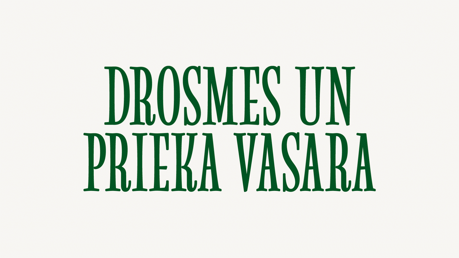
Modular typography
The historical references were embodied by the central visual elements of the Summer of Courage and Joy – a unique variable font that challenged the local perception of aesthetichs and readability. The typography ranged from readable letters in more funcitional printed materials to decorative elements in the dynamic parts of the digital identity.
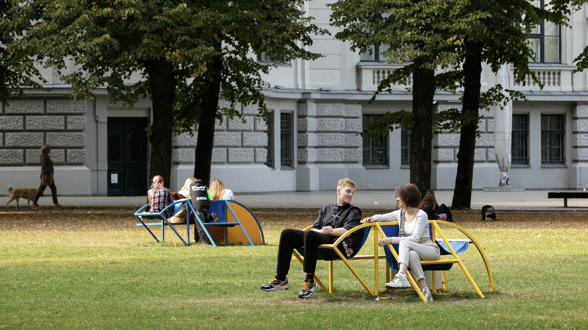
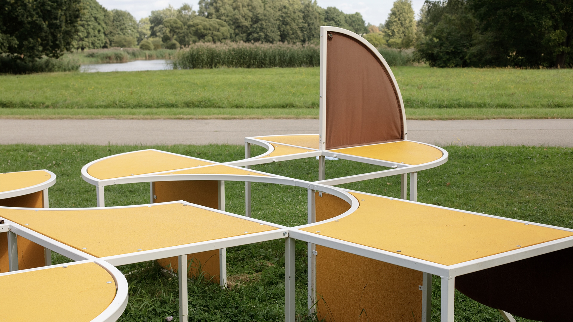
Embodied letters
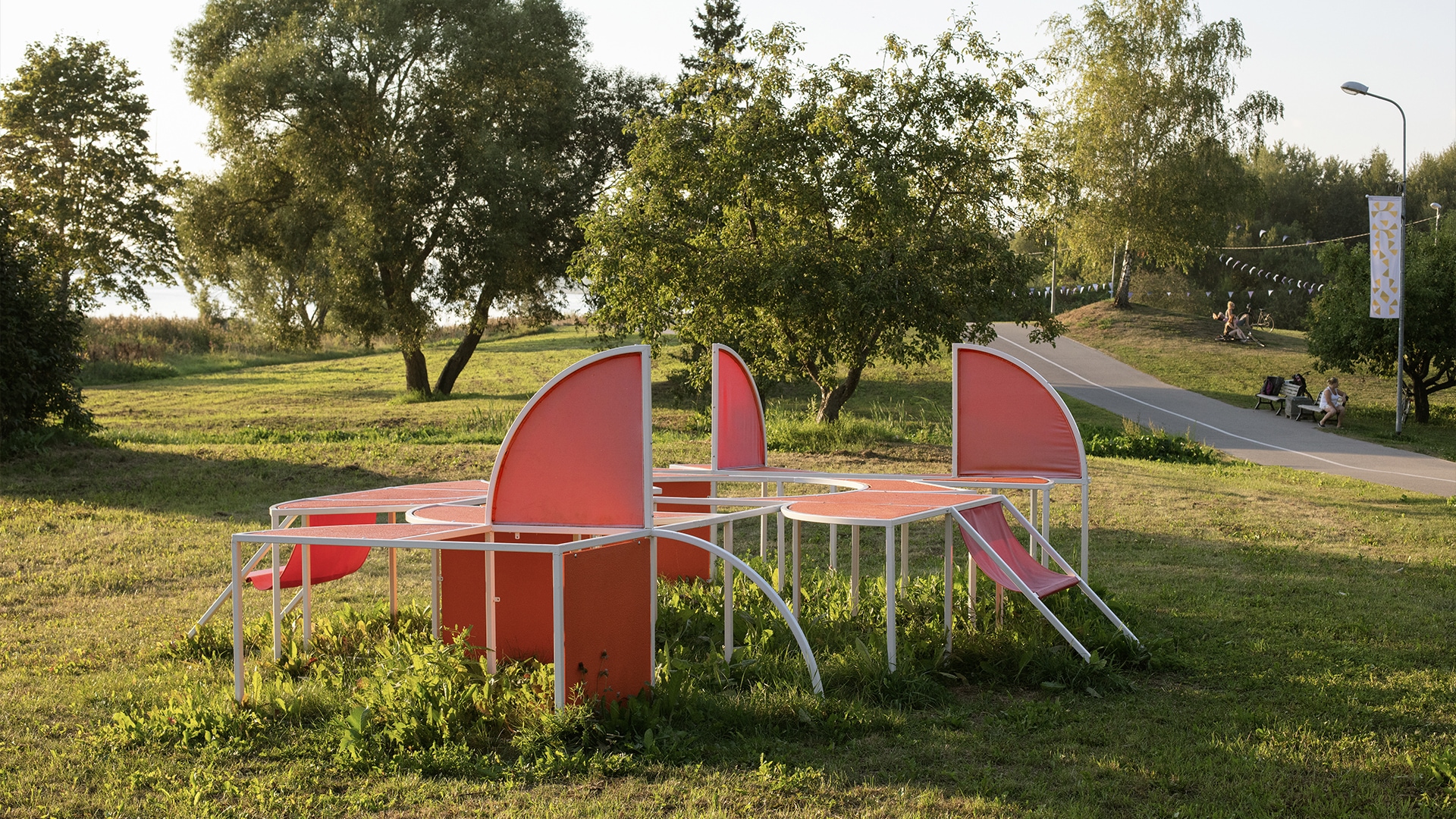
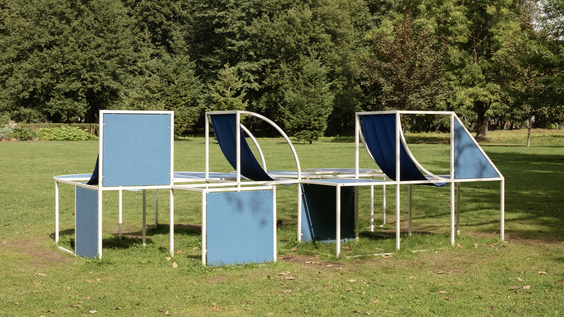
Our identity aimed to also inhabit the physical space though objects that would serve as scenographic elements of the city as well as representation of the identiy in local parks during the summer events. Together with artist Miķelis Mūrnieks we designed objects that directly emerged from our modular typograhy and quickly became community meeting points.
The identity was comissioned by Riga City Council and developed between March 2022 and July 2022 in collaboration with designer Kristiāna Marija Sproǧe and artist Miķelis Mūrnieks .
Identity for a healthcare system
Rūre is a new system of healthcare that combines social assistance for the elderly and high-quality palliative care.
In Latvia social assistance for elderly as well as care for terminally ill are services usually lacking quality and thoroughness. Rūre’s a private organisation that aims to improve medical and social services funded by the government by offering an outsourced system of care to public medical institutions funded by the state.
Research and Context
According to the Latvian medical system, government-funded social care provided in homes for the elderly is compartmentalized from the government-funded medical care as different local ministries are responsible for maintaining quality, assigning funds, and managing these services. The goal for Rūre was to offer a holistic service that can be outsourced by the state to ensure happier lives for Latvian elderly and palliative care patients who require a certain level of social and medical service at the same time.
Identity that embodies a whole life
Rūre’s identity was based on a goal to offer the patients “A whole life” - a reference to the process of uniting social and medical care under one provider as well as an idea of Rūre as a place where one can experience a whole life of experiences and moments that palliative and elderly patients are oftentimes denied.
Identity and website for Rūre was developed between February 2021 and July 2021.
Identity for Latvian youth
LJP is the National Youth Council of Latvia — a non-profit organisation that represents the young.
Before the new identity, LJP had successfully defined the practical goals of the organisation — a three-way ambition to encourage Latvian youth, work with local youth organisations and lobby the youth interests at a state and regional level. Yet, they lacked an internal understanding of what is the collective goal of all these organisations that were uncovered in the new identity.
Language for the youthful energy
LJP perceives young people as an infinite source of energy. The identity helped articulate LJP as a widespread energy network that benefits several stakeholders responsible for the well-being of local youth - the government that gains insight regarding the interests of the young in Latvia, the youth organizations that use the network to achieve their initiatives, and the youth itself for whom LJP′s network is a chance to test their ability to foster change.
Nationally relevant visuals
Visually, LJP′s identity became a nationally representative vessel for information emerging directly from the national symbols of Latvia. As an international activist, LJP needed a visually unique way to carry Latvian identity abroad through visual elements on printed and digital materials.
Digital identity
The new identity required a restructuration of the organisation′s website that holds a large amount of information for various visitors with the highly readable large size typography and the option to switch the website to a reader accessibility mode.
The positioning, visual system, website archtecture and design was created between November 2021 and January 2022.
A website for the local comedians
Comedy Latvia is Latvia′s biggest stand-up comedy collective that had just launched a new visual system that needed to work on a digital platform too. We worked on information architecture and page design for their website.
Starts with a joke
A website of a comedian should best represent their ability to joke and that is what the Comedy Latvia website starts with. Any other information is secondary, what awaits you entering their digital platform is a scene from their latest stand-up.
Witty designs
We wanted to tease the viewer with slightly annoying design solutions all through the website like endless popup windows that are not what they seem and little surprises along the way.
Language limitations
Jokes are inherently language-based and we understood this limitation in building the website too. Comedy Latvia website is Latvian only with alternative descriptions and contact information appearing when you try to change the language to English or Russian 2
The website was developed between June 2021 and August 2021.
An identity for facility managers
Termex is a company that does facility management — a process that is obscure to most but needed more than they know. This identity was built as a tool that helps explain the services Termex provides that ensure the safe use of public and private buildings.
What is beyond buildings?
Facility management includes multiple services, in the case of Termex — everything that is needed for the smooth functioning of a large-scale building, be it a hospital, shopping mall, embassy, or school. Termex offers electricity, elevator maintenance, security solutions, and other services that ensure the efficiency of a building — everything that is beyond what we see and enjoy from outside. Termex acts beyond buildings.
Three dimensional services
In the new identity, Termex products were assigned detailed illustrations of the processes behind each service that became visual articulation of the complex process behind what Termex does. The Termex cube represents both the houses they manage as well as the variety of solutions they can offer.
Termex positioning, visual system and website was developed between November 2020 and March 2021.
Studio talk
Evija: 23 questions.
First, we talk about our studio, then about design in general.
Valters: Wow.
E: What is ‘Support System’?
V: What are we or whom we would like to be?
E: Good question. First, who are we? I don't think we can answer whom we want to be.
V: Who are we? We are simply friends.
Yes and, primarily, a design studio
Studio talk
Evija | 23 questions. First, we talk about our studio, then about design in general. |
---|---|
Valters | Wow. |
E | What is ‘Support System’? |
V | What are we or whom we would like to be? |
E | Good question. First, who are we? I don’t think we can answer the second. |
V | Who are we? We are simply friends. |
E | Yes and, I think, primarily a design studio. |
V | But is it a design studio? Is it... |
E | A passion project. |
V | Passion project (laughs). Because I don't think we've ever defined it yet... |
E | I feel like we're trying now. So anyway, is it a design studio that deals with brand design? |
V | Strategy and visual communication. |
E | Not really strategy... I've been trying to call it positioning for a long time |
V | Why don't you like strategy? |
E | Because strategy is a way too big and unnecessary word. Strategy is a way to get from point A to point B, but positioning is your location in a particular context. Positioning is what defines a place in a particular market, the strategy is steps to get what you want. |
V | Yes, yes, ye, I see. Anyway, I read today that it is no longer okay to talk about brands and branding. |
E | In general? |
V | Yes, because it is a very outdated term and is rooted in the wrong traditions. |
E | What are these wrong traditions? |
V | Branding as such comes primarily from the beginning of corporations or, even earlier, from slavery, animal branding/burning. We'll talk about visual language instead. |
E | We chatted with Kristiana a couple of weeks ago and tried to generalise what the designers who are part of KDD are doing. We decided it's mostly visualising information. |
V | Yes. |
E | Visualisation can be interpreted in different ways. Visualisation can also be the creation of a product itself. Functions are defined and then you visualise those functions in a physical or digital object. It can be a visual message, but it can also be an object or a service, no? The physical thing is also based on visual features, so it is still the visualisation of information. |
V | Yes, that’s right. How did we start this? Our studio, the visualisation of information. I don’t remember, do you remember? |
E | I remember. Someone who needed an identity for their product came to us. Then we created a nice identity project or two and then it kicked-off from there. |
V | To me, that moment was very formational and we succeeded because we were unemployed just before we started working together. We each had our own experience, but we did not have some common heritage or thinking to carry with us. This client did not come to us as part of an agency or studio, where the methodology is already in place and the way of work is pre-determined. We tried to understand from scratch how to do it, so that it would be high quality and efficient and without unnecessary bullshit. |
E | But WHY were we able to do it well? |
V | Because we already had experience. |
E | Overpriced academy. (Both laugh). |
V | It was Overpriced where I first saw the interaction between positioning and visual language. And the visual language is always built on positioning, it was never random. It always seemed very reasonable to me, but in my community at the time, people rarely did it. At Overpriced we learned how to make brands for sure, but I think we now aim to go beyond it. |
E | Why do we do commercial design at all? |
V | It helps to influence the system in which we are and live in anyway. I have people at school who think that commercial design, brand design, in all its forms is disgusting, but I think it's a stupid position to be in because then you bury your head in the ground and can’t really influence the game of capitalism. |
E | Yea, it seems to me that the reason we have chosen to take part in it is that we can see how we can make the system we hate at least a bit more pleasant to be in. We are in it anyway. Identities and brands are commercial products, but they can add value to the organisations we work with. |
V | Right, and I think we have a very realistic view of what that system is. We do not lie to ourselves about doing something extremely noble. But you have to be able to play by the rules, if you play chess, you can't turn the table and run away, somehow you have to strategise through it. |
E | So what is it that we do? Create brands / organisational identities, what else? |
V | I think we are trying to find a balance. One is the identities of the clients, through that we hope we add value to the contemporary capitalist world. What I personally like about this is the ability to illuminate the information or the people who deserve it. Design is very good at doing this. The second thing we want is to build culture, right? |
E | Right. For example, with KDD |
V | Yes. I think KDD exists because we as designers are more interested in people than design. We are interested in reflecting. on and talking about design more than seeing the design. |
E | For me, KDD was definitely the point where my lost hope in design returned. In Latvia and in general. Because you finally see some real faces that make the industry juicy and in practice do the things I had only seen in theory. |
V | It’s funny that other designers also felt the same way we did. There was no FB group ‘Latvian designers. Welcome’. |
E | There wasn’t and I don’t think many felt the intellectual fulfilment from the design industry before KDD and now we all have that sense of belonging to some collective understanding of design. |
V | I definitely feel fulfilled from school, but what we are talking about in KDD are much more abstract and larger topics that are no longer about the profession and there were no such precedents for such conversations in Latvia before, or if they were, they were very curated, such as public discussions, which quickly become formal and anti-climatic. |
E | I think openness is also a big point. KDD filter is close to zero. |
V | But what’s more interesting, at the same time everyone is terribly positive and nice too. It is not a quiet judgemental corner, it is really a lovely community. |
E | Why do we work in a pair rather than in a larger team? One is that we are friends, of course. |
V | Yes, and we have a very similar view of how the world works and what we can do in that world. |
E | We also have a similar view of what a design studio should do in general and what the role of a design studio might be. |
V | And what design has to do in general. |
E | What does design have to do? |
V | Well. The information must be communicated. Honestly. That’s the most important thing |
E | What is our process? |
V | The quicker the better. (Laughs). No, no. First, we find people who do good things and talk to them. We make friends. |
E | A good ‘thing’ is a pre-requisite to a good identity. |
V | Yes. We explore the thing and we try to find the most relevant way to highlight it. |
E | We sometimes say the most ‘honest’, I recently thought about it and realised that what I’m actually trying to do with the positioning is to articulate what the organisation is already doing. Articulation is important for delivering information. When people come to us, they come with content that is often chaotic and my job is to find the words to tell who they are and what they are doing so someone actually hears it. |
V | Yes. This goes back to what we said, that the task of the designer is to take information, organise it, and give it a new meaning. |
E | What is the context we familiarise ourselves with before we start the projects, the building of new meaning? You have mentioned several times that many of our decisions depend on the context. How do we build that context? |
V | It seems to me that we are building this context, first of all, every breathing minute. That is our added value in some way, being interested in all things possible in this world. And the context also comes from culture, the environment, and all the peculiarities that come with either industry or a specific niche the organisation is based in. |
E | Maybe what sets us apart is that we look rarely at the characteristics of people who use the product or service, but more at the culture and environment in which the organisation is positioned. And we try to understand how to be a good part of this culture and society, not how to be more interesting to the ‘consumer’. |
V | That's true. We care more about the culture than the user. |
E | And we’re shooting ourselves in the knee, being in this industry and saying that we don’t care what the consumer thinks, but it’s a reality. |
V | It is. |
E | I think it also resonates with the way we look at brands in general. We never make decisions because it is ‘statistically proven that people working in the IT sector are more inspired by blue’ so this colour palette will be blue. If we chose the colour blue, it would be our personal interpretation of the thing the colour blue represents in this culture or simply a subjective preference. Or taste. |
V | We just don’t think statistics is a way to build narratives, I think. Statistics in design often replace stories and make everything impersonal and utilitarian, we very deliberately try to avoid it. |
E | What do you like about design? |
V | Wittiness. But not jokes. Solving the puzzle. Coming up with something clever. Every day I feel surprised by these witty solutions I see in design, the small nuances that surprise the viewer. It is the power of a message you succeed translating in a visually interesting way. And then anyone who looks at it has the feeling that someone has invented a little puzzle for them. This is Paul Rand’s 2 + 2, a design where everything comes together. |
E | A feature of a strong identity, I think, is consistency, and that’s where 2 + 2 appears best. This witness must appear in both content and text, as well as in visual language. |
V | Yes, and that’s why I find it so interesting to find the best way to translate context visually. Figure out how to transfer the story to another medium. |
E | We discussed what design is a few days ago and we agreed that design could be a blueprint for building something. This is how our identities work. It’s not an aesthetic or a ready-made product that we deliver, it’s a guide for your organisation on how to look and how to talk. |
V | I really like it, it’s true. What we do is give steps on how to use design and how to maintain an identity. And to maintain cleverness. We need to ensure the client is capable of replicating the visual language and communication. |
E | What is the role of a designer? |
V | We had a lecture from a French letter designer and one of the questions he raised was why we need new fonts when we already have so many, and I loved that he said that it’s about culture. We need to keep on creating something new that reflects the current world. He also advocated for not buying old fonts. Buy fonts made by this generation of designers instead, they are the people who are actively building the contemporary culture of aesthetics. CAPS LOCK talks about the fact that the designer can play different roles, I think there were 9 distinct categories. Designer as an artist, designer as an engineer... Different contexts. |
E | It is interesting that once the role of both the artist and the designer was being a craftsman, but now artists have occupied the role of a conceptual thinker, but a designer is sometimes a creator of culture or services, but sometimes lost. It is very abstract to me, what a designer means in the 21st century. |
V | Nothing really distinguishes an artist from a designer anymore. Maybe the tools you use, but not really. Theoretically, in design, you work with existing information, while the artist can reflect on anything. In real life, of course, this distinction no longer exists. The only thing that designers perhaps understand better is the layout and typography. |
E | Let’s talk about Flower Project ? Why are we doing this? |
V | There is no need really. |
E | Just a beautiful, pointless project. And it seems to me that this pointlessness is how we balance the fact that we are always working with a clear goal when we work with other people, with clients. Primarily, the idea was to do something that we love, but that is also completely pointless in our professional sense. We both love flowers and we chose to share them with other people, it’s nothing more really. It is a seemingly cliché object we chose to work with and turns out everyone loves flowers more than expected. |
V | There’s that naive simplicity, too. |
E | We just always wanted to own a flower store. |
V | Flowers make people happy, no one can argue about that. I have always been very tempted to work in a flower store, but at the same time, I have always felt very banal about going to that shop, buying those flowers, and giving them to someone, because it is also the ’last resort’ gift sometimes. You use them to get out of the problem. |
E | But in its essence, it is not about that and we tried to show it. The simple beauty of flowers. There is a fundamental difference between wildflowers and industrial flower types that people don’t seem to notice. The flowers in a conventional flower store are insanely simplified and adjusted for the market, the rose has a few thorns, while the wildflowers are these extremely complex structures that are not efficient for the market. But they have so much character. This complexity is beautiful and we just generally hate when things are simplified for market reasons. Simplicity sucks. We are also not interested in visual purity, I guess. This project just represents what we think once again. |
V | What do you think is a good design? |
E | I don’t think there’s a good or a bad way to create a design, it all depends on whether it’s a good match to what the design is made for. Is it a good match between us and the client, or is it a good match between the ’problem’ and the ’solution’? This is why the ’About Us’ section of our website will be this long and annoying interview not two sentences about our work. Because this is the best way for someone to get to know us and understand if we are a good fit for them. We have our way of making identities and we have our interest in flowers and we want clients who love our way and who also appreciate the flowers. |
V | That’s exactly how I feel about the entire Latvian design industry. It’s not that someone is a better or worse designer, it is just about who needs what. There are different cultural contexts for designers as well as for clients and each of them can find a good match. We are both aware that our beliefs are not the most relevant, we just personally like our beliefs the most. |
E | Yeah, it’s just like a relationship. Choosing a design studio is the same as choosing a girlfriend. A girlfriend for a month or two. Has to be a good match. |
V | Exactly. Because of that match, we can come up with something that we all feel happy about in the end. |
E | Drop us a message if you think we’re a good match. And if you see spending a solid four weeks with us and enjoying that. Needing design is not enough. |
V | That’s right. You have to want to be friends with us, then we can work together. |
E | Honestly |
V | Really. |
The conversation took place on the evening of December 29, 2021
Our identities articulate and visualize content-rich organizations, events, and places through research, text, and graphic design.
Additionally, we create websites that embody the identities we build. This process involves analyzing organizations' content, creating text, structuring information for digital use, and building a design. We do not code, but we know people who do.